I thought I would share a few of my top 5 picks from Jordan Essentials product lines. My sweet friend Beth Ann introduced me to this wonderful company and their natural skincare products last fall. I love them because they WORK, with the added bonus of being good for you. I fell in love with the basic body care set and how wonderful my hands felt after my hand spa treatment. Since then, I joined as a consultant and use their make up and face care lines as well as many other products which I am about to highlight.
Top 5 Body Care Products:
1. Basic Body Care system, which includes salt scrub, body lotion or body butter, and lotion bar. My first hand spa treatment using the foaming body wash and salt scrub was heavenly. My hands get so dry from washing dishes in the dry winter months that they crack and bleed. It hurts. Last year I gave myself weekly hand spa treatments and used the JE body butter and lotion bar to seal in moisture and had no issues. I think I got one crack in my finger. Amazing. During the summer I use these products to pamper my feet and keep them soft and flip flop ready.
2. Essential oils Deoderant. I used the regular JE aluminum free Deoderant first, but was feeling sticky under my arms. The new essential oils Deoderant is so much better. I still struggle a little bit cause I sweat so much and odor is just a problem for me no matter if I use antiperspirant or not. Overall, I am sticking with it and like it.
3. Happy Feet Foot Spa products. Love the way my feet feel after a soak in the Dead Sea salts, foot scrub, and then cooling peppermint lotion and lotion bar. Definitely do not need to pay for pedicures.
4. Dead Sea salts. This product is super therapy. Great to help with feeling better when you have a cold. I have helped my sons feel better when sick by making them soak in a full tub with the sea salts or just soaking their feet.
5. Body wash. I use this at all the sinks with our foaming dispensers. I like knowing we are washing our hands with good for you ingredients. Our hands don't get dried out either.
Top 5 Face Care Products
1. Basic Daily normal skin care system, which includes foaming cleanser, lotion, and toner. I love these products and so does my somewhat oily face. I have very very few breakouts since using these basic products.
2. Anti-aging serum. My face is even toned, soft and firm from using this serum.
3. Dead Sea Salt bar soap. I use this in the shower to wash my face, shoulders and back. Helps keep me from breaking out with pimples, which my back is so prone to do. I use the facial brush to apply the soap.
4. Clay mask. This is a miracle product. I like it for spot treatment of blemishes, but the biggest use it has had is for relieving the itch from bug bites. Who knew bentonite clay was such a wonderful detoxifier of bug venom...
Top 5 Mineral Make up choices
1. Tinted moisturizer. Not a base make up. It is not heavy feeling. Just a light tinted moisturizer that evens out my skin tone in the winter months. I love this stuff. I do not wear much make up, but I really like this.
2. Mineral eye shadow. Great coverage with their brushes. I like the pretty colors and that they stay put and blend easily.
3. Eye primer, which is the secret to great eye shadow coverage and staying power. It lasts a long time.
4. Mascara. No flakes, smudges, or smears. Period. Comes off pretty easily when washing. Usually have to finish taking it off with eye makeup remover.
5. Mineral powder and blush. Great matte finish and silky feel. I use these in the summer to cut out shine. Love the kabuki brush.
So there are my favorite products. There are a lot of them. I left out a few, and I have a feeling I am going to love the new Essential Oils line for natural remedies to headaches, sinus problems, and stress.
If you have questions about any of these products or are intrigued and want to try them, please contact me or visit my Jordan Essentials website. I would love to help you learn how to take care of your skin with good for you products. Your whole family will enjoy these products. Mine do.

Monday, July 22, 2013
Summer Card Camp Week 3 Day 1 card number 2
Here is a second card I just whipped up after playing with the blues and purples with the shading on the new Delightful Dahlia Additions stamp set I just bought. Fun. I think this looks pretty neat, and I tied all the colors in together using sketch 3. Photographing cards with rainy/cloudy daylight is pretty hard. Not a photographer either. I am doing good to get a card made and put on the blog. :) My sentiment looks much sharper and crisp in real life. I guess the camera focused on the flower and not the words.
What do you think?
Edited to add: thank you for all your sweet comments. I really struggle to come up with my own designs whether using a card sketch, color combo, or staring at a blank canvas. I was really pleased with how this card turned out.


What do you think?
Edited to add: thank you for all your sweet comments. I really struggle to come up with my own designs whether using a card sketch, color combo, or staring at a blank canvas. I was really pleased with how this card turned out.


Summer Card Camp Week 3 Day 1
Here is a card I made based on Jennifer's card in today's class. The color scheme for this week just said wintery holidays to me, so I went with it. The tone on tone background of snowflakes was made with my new Illuminate shimmer ink pad. Love the look. The colors I used are SU! Pool party, winter wisteria, kraft, and rich razzleberry. That was the match based on what the colors looked like on my computer screen. Dies and stamps are from Papertrey Ink.


PTI July Blog Hop part 6
Whew!! I did it. I used all 6 color combos. Here is another card that I got the idea for from Dawn's release post, but I didn't want to totally copy it. I am trying to stretch myself to come up with my own cards. I am great at CASEing cards. "Why mess with perfection?" I say. I am usually so short on time and overwhelmed with all my stamps and options, I just find it easier to use their designs as a starting point. I stamp to relax and trying to come up with my own layouts and designs is really way too stressful. Anyway, I digress. This card did not turn out quite as nicely as I hoped. It does have great dimension, but it doesn't pop and look polished enough. I did spritz it with some shimmer mist after I photographed it, but I think that it will not be a repeat card. This color scheme was hard. That scarlet color just did not fit in right. I think a banner label die cutout with a sentiment would have been a better choice too.
I am just proud that I completed all 6 color schemes and played along. Enjoy!!


I am just proud that I completed all 6 color schemes and played along. Enjoy!!


PTI July Blog Hop part 5
Okay so this little number did not turn out quite the way I had hoped. The tag proportions were a little too big, but I am not one to waste what I have worked on so hard. I went with it anyway. I think it is not too bad and I will definitely use it.
I used the color palette of harvest gold, melon berry, summer sunrise and new leaf. The melon berry is the smallest detail/layering part of the flower. I love the way it blends with the two yellows. It is soft and subtle. Love those dahlias.


I used the color palette of harvest gold, melon berry, summer sunrise and new leaf. The melon berry is the smallest detail/layering part of the flower. I love the way it blends with the two yellows. It is soft and subtle. Love those dahlias.


PTI July Blog Hop entry no. 4
Here is the 4th color combo. I just got new goodies from PTI. One of my new sets is the Delightful Dahlia Additions. I loved the cards Dawn made during the preview week. However, recreating those pretty layered designs with these stamps was not as easy as I expected. Those little shading layers are hard to line up. Kind of like the rose layers in The Sweet Life. I had to experiment a lot to get this right and even then, it is not always perfect. I found that on the larger flower I needed to stamp layer 2 first, then the third layer, and then the 1st largest layer. It was easiest to line them up that way. For the smallest flower, the smallest details were stamped first, then the 2nd and then the last layer. Still had lots of trouble with the small flower, so I opted for just one shading layer on that one. Sigh. I will keep practicing. Maybe it was the color combo, maybe it is just my 40 year old eyes. ;)
I used the color combo of pure poppy, raspberry fizz, berry sorbet, and new leaf. So pretty.


I used the color combo of pure poppy, raspberry fizz, berry sorbet, and new leaf. So pretty.


Saturday, July 20, 2013
PapertreyInk July Blog Hop part 3
I am hoping to get all 6 color palettes in the blog hop. I got new goodies from PTI today to help me out. :) Here is the third color palette: scarlet jewel, melon berry, hibiscus burst, summer sunrise, and orange zest. I totally used the photo to inspire my projects with all those stripes on the popsicles. Yum. I needed to make a sympathy card so I used that as the greeting on the one I like the best. I again was inspired by some PTI designers: Maile and Nichole. I used Happiness in Bloom and Watercolor Wonder background for the cards.


PapertreyInk July Blog hop part 2
Here is another card I made for the July Blog hop. I used the citrusy palette of lemon tart, summer sunrise, orange zest, limeade ice and new leaf. Very fresh and vibrant color palette. I used PTI set of Happiness in Bloom, Beautiful Blooms 2 die, Sending You die, and Background Basics gingham. I subbed some SU! colors for the PTI colors because they match so closely and they are what I have. Enjoy this bright and cheery card inspired by one Nichole did awhile back.


PapertreyInk July Bloghop


Tuesday, July 16, 2013
Summer Card Camp Week 2 Day 1
Back again with another card for Summer Card Camp 2. I am enjoying the card sketches and the color combos that this class is giving. I also like the technique tips as well. I have not been able to play along as much as I would like, but got to put this idea to paper last night using sketch 2 this week. Might be my only card again this week, but at least I made this one. I got my new MFT Washi tape background stamps yesterday so I got to use them with the dies. Fun fun. They are very cool and I can't wait to use them more.
I used my ipad 2 to photograph this card and it was late last night. Therefore, the card is dark looking and the greens and aqua mist color do not show up well.


I used my ipad 2 to photograph this card and it was late last night. Therefore, the card is dark looking and the greens and aqua mist color do not show up well.


Tuesday, July 9, 2013
Summer Card Camp 2 Days 1 and 2
I made these two cards tonight using the color scheme and card sketches for week 1 of the Summer Card camp. I like the sketches a lot this week, but the color scheme is not my comfort zone. But I guess that is the point of the class--to stretch us out of our comfort zone. I used SU! Colors of Bermuda Bay, Pool Party, Daffodil Delight, Pumpkin Pie, and Melon Mambo with black as my neutral.
I tried one of the techniques highlighted on day one by embossing a vellum overlay. I put my own spin on the striped panel from the sketch by using my Watercolor Wonder background stamps to make stripes. All stamps are PTI.
I am looking forward to each day of this card class. I really need something to get me back into stamping as I have pretty much done nothing all summer. I could use a little creative me time.
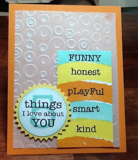


Subscribe to:
Posts (Atom)