Wednesday, February 25, 2015

Some more cards I have been working on.

So I have been trying to use my neglected stamps and accessories lately in an attempt to justify all the stamps and stuff I have accumulated over the past 8-12 years.  I got some new goodies in January and have been trying to use them before they get shoved aside and neglected.  I made these cards using a new SU! Sale a ration set, new SAB designer series paper, and my new PTI cake stand dies, which I love.  I also used a neglected Foodie Fun set for my cupcakes.  I think they turned out pretty cute.  


MIM#202 Anchoring a focal point with banners and border dies

I made this card just last week, and look, it fits perfectly with this week's MIM challenge.  Awesome! I used a card that had used only Stampin' UP! stamps and embellishments and used my PTI sets and border dies to create a similar look since I didn't have the SU! stamps or embellishments.  I think it turned out rather cool.  Trying to get more masculine cards in my stash.

Supplies used:
Stamps: PTI Celebrations, Bitty Dot backgrounds, Wet Paint I set, and MFT washi tape backgrounds
Inks:  SU! bermuda bay, chocolate chip, crumb cake, and pool party
Accessories: SU! large dot embossing folder, PTI stars border die, fabulous frames die, bakers twine


Friday, February 20, 2015

MIM#201 Embossing paste and cover plate stencils

I almost didn't join in this week, as I don't own any embossing paste.  Then  I saw K and R Designs post about using stickles and glossy accents with a stencil.  I have those things, plus pearl accents paint, so I gave it a try using my pearl accents paint.  I only used it on a tag using the circles cover plate.  It turned out ok.  I used my heat gun to speed up the drying process and made the pearl paint crack a little, but since I covered up most of the tag with baby accents, it looks fine.  It all turned out better than I hoped, but it used a lot of pearl paint.  I can't invest in new items right now, so I may have to use glossy accents or stickles glitter glue next time.  Definitely not a technique I would normally try.


All supplies PTI except the embossing folder for the background on the card base layer and the baker's twine.  

Masculine Birthday Cards

So, it is always a challenge to make masculine birthday cards-- well, cards for guys in general.  Yet, we always need them don't we.  So here is how I have been trying to make some cards using sets that might at first seem a little less than masculine.  It is all about the colors, layout, accessories or lack thereof.  I kind of like what I came up with this time.  I also challenged myself to use some card sketches I printed off from MFT stamps, and switched up a great card I found today by Brian King.  So here they are:


I am trying to use up this yummy Birthday Bash DSP by Stampin' UP!  I love the colors, the patterns, and that little fleck of gold.  So pretty and great for masculine cards.  I used the new SAB birthday chalkboard set for the circle cake card and Building Blocks by PTI for the phrases on the strips.  Love the gold embossing.  The green card used the Happy word die from PTI Tipped Top dies, Birthday was stamped from PTI Wet Paint 1 set.  The button with gold string sets the vellum banner off great.  Just wish I had better vellum adhesive.  Both of these cards were based on MFT stamps sketches.  


This is the card I CASED from Brian King but with my own twist because I don't have any of the stamps he used.  I found the perfect substitutes though and am totally pleased with how this turned out.  They are 5x5 cards, which means I need to use my envelope punch board to make some custom envelopes.  Love the girl and boy version.  

So what do you think?  Did I achieve a good masculine birthday card?  I am really trying to use what I already have, rummage through all my various stamp sets to put them to good use, and am trying to use card sketches and my DSP hoarded stash to make cards these days.  I still do a fair share of CASEing for a quicker card, but am finding my way around sketches.  I tend to be pretty literal in my interpretation and am learning that I don't have to be.  It is hard though. Totally stretching my creativity.  

Thursday, February 12, 2015

PTI Anniversary Celebration: Day 8

Whew!!!  Two more days to go for all the Papertrey festivities.  I am kind of ready and know it will be sort of a withdrawal period after this is all done.  I like the new products Betsy designed that are revealed today.  I especially like the sentiments with the set.  Wish I could just get those to play with. I made an ombre blue card and pulled out some oldies but goodies with Scattered Showers, Clouds dies, Ombre Builders, and Scattered Showers Additions.


PTI Anniversary Celebration: Day 7

So today's challenge was to use metallics with a neutral color to celebrate Papertrey's addition of metallic papers and printed papers.  I love the printed papers.  Very pretty.  I like the matte shimmer of the metallic card stock.  And the adhesive metallic papers are very nice too.  If I win some money from all these challenges, I might have to wait till these new papers come back in stock (cause you know they are going to fly off the shelves) and get some.

I have two projects to share.  One that sticks with challenge rules of metal and one neutral, and one that does not.  I like the one that doesn't adhere to the rules the best.  I have a friend who is a consultant for Jordan Essentials and she wanted me to make some treat bags to use as booking incentives.  I came up with these bags.  I like the whimsy of all the ribbons and pieces all attached together with the clothespin.


Tuesday, February 10, 2015

Papertrey Ink Anniversary Release: some honest thoughts

I have been a huge fan of Papertrey Ink for 7 years now.  I always look forward to each new release and all the cool products they come out with and the truly amazing design ideas the design team showcases.  Their creativity has made me want and buy way way more than I ever should.  Really, how many stamp sets and dies does a person really need?  When you have spent enough to buy a nice used car, I think some warning bells should be going off to step back and stop buying.

Those warning bells have been going off for at least a couple of years, and last year I really tried to cut back.  I did ok, but not well enough.  I bought my last installment after Christmas and spent way too much of my Christmas and birthday present money.  I really need to stop.  I want to travel with my family,  there are classes and extra curricular activities I want my boys to be able to do, there are things we need to do to our house and yard, and well, life just can't keep supporting a craft spending addiction.

That being said, and with a wholehearted decision to not buy anything new from Papertrey Ink this year unless I win a contest and then spend only the amount of the prize money I receive, I have to honestly say that I am not really all that excited by this Anniversary release.  There are some cool concepts being introduced or added to, but really, nothing is screaming to be bought.  Anyone else out there feel that way?  I know it is only halfway through the release, but I just am not super impressed.  I guess the stamps and dies are not my style, or I just don't make cards for those occasions.  I love Easter, but I just don't make cards for that.  I have bought stamps in the past for that but never used them really.  I find that birthdays, Christmas, thank you, get well, and friendship/encouragement cards are really what I make the most, so I intend to use what I have for that.

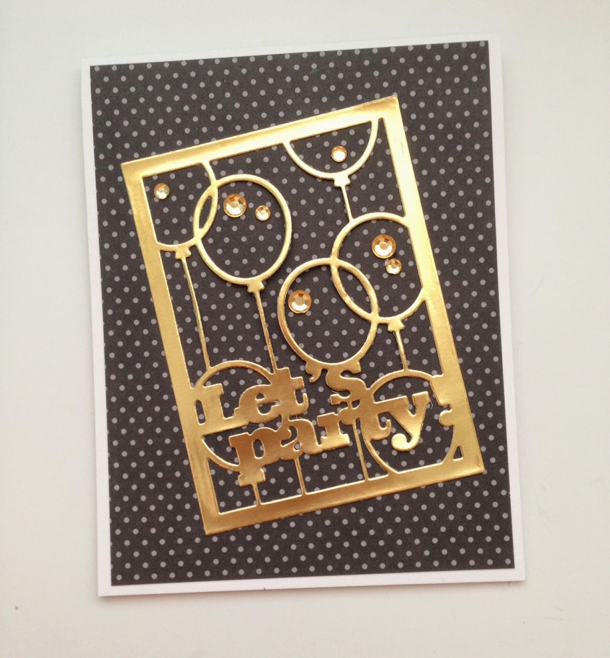
I have had a lot of fun over the past several days making cards for the anniversary challenges.  I have dug out some stamp sets that need some attention (they all do), and it was invigorating to use them again.  It kind of took some of the guilt away from having so many stamps and dies.  That is my resolution this year and going forward.  Just use what I already have and breath new life into my stamping by using card sketches and color challenges.  I want to grow beyond CASEing everyone else's stuff, even though it takes me less time to do that.  Also, I hope to recoup some of the money I have spent on all this stuff by selling cards.  I just post a grouping of cards on my Facebook page when I have something to share.  

Just thought I would be real and open myself up to being held accountable with regards to all of this.  What do you think about the new Anniversary release products?  Are they making you say, " That is cool, but I don't really want it for myself."?

Sunday, February 8, 2015

Everything Old is New Again....

And some things are just new but need to be broken in.  Here are a couple of cards I have made this week with some older stamps that have been lying around and some new goodies that had yet to get inky.  Enjoy.  It just so happens that Day 5 of the PTI Anniversary celebration was to break out a new set that had not seen ink yet or a set that had not seen ink in a really long time.  All of these cards fit the bill.  Yay!! Love it when things work out like that.

Stamps: SU! Seaside sketches
Papers: night of navy, kraft, calypso coral, soft sky
Other: blendabilities markers, button, twine


Stamps: On My Couch, Take Time to Heal, and A Cheerful Heart


New spy stamps from January release. 

PTI Anniversary Celebration: Day 4 build a bouquet

This one took me much longer to make than any other day so far.  I have two cards for you.  One I made just earlier this week that allowed me to develop my coloring skills with my Stampin' UP! Blendabilities, and one I made today based on a card I have pinned on my Daydreamer set Pinterest board.  I didn't add all the extra touches the original creator of the card did.  She had stitching and baker's twine on her card.  


I enjoyed breaking out some very unused sets like Daydreamer, Friendship jar and the spring jar fillers, text style backgrounds, rosie posie, polka dot basics, and garden variety.  They needed a little love.  

Saturday, February 7, 2015

PTI 8th Anniversary: Day 3 gift tags and packaging

Woohoo!  Love the challenge/contest today.  It is right up my alley as I love to give gifts and wrap them up all pretty.  My little gifts of thoughtfulness usually revolve around food of some sort, dessert mostly, and so I went that way today with my project.  I have had the idea to use the Phrase Play Enjoy frame die as a food tag in my mind for the last few days.  So today was a good day to execute that idea into paper.  I used a plethora of food stamps including the recently released Canned set.  Love that set.  This is my first time getting it inky.  Love the idea of stamping on those wooden tasting spoons but my images did not stamp very crisply.  They kind of bled a little.  So the blurry image in the photo is not crisp looking in real life.  But I think it turned out cute anyway.  I made a simple box to fit a short but wide canning jar in it.  I tied it all up with some pretty striped ribbon, tied on my tag, and voila.  Dimensions on the box are 3 1/2" square by 3" tall.  That takes a 9 1/2 x 9 1/2 piece of cardstock scored at 3" and 6 1/2".  Super easy.

Now when strawberries come in in my backyard strawberry patch, I can roast them up with some vanilla and maybe some yummy strawberry balsamic vinegar and serve them over a no bake cheesecake or baked cheesecake in a jar.  Wouldn't you like to have some?  Come on by and I will serve you some berry deliciousness.  Can't wait for spring.


Here is another little box and tag I whipped up much more quickly than the first one.  I am kind of surprised my brain is working at all today as I have felt pretty awful with this flu I have.  I thought I was getting better, but it hit me hard again today.  Go away, flu, go away!  Anyway, I played with some new stencils and little take out boxes I got from Stampin' UP!.  Plus finally got around to using my stitched heart dies from PTI.  I really like the papers in the new Stampin' UP! Stacked With Love DSP paper stack.  They are nice patterns and color combo.  Not super trendy, and all the papers have a black and white print side to them that makes them classic.  I think I might have someone in mind for this box, but it will depend on when I feel better as to when it will get sent out.  Might be a little late for Valentine's Day, but anyway is a good day to get a little love in the mail.  That is my motto and I am sticking to it!


Friday, February 6, 2015

PTI 8th Anniversary Day 2: Inspiration from Maile Belles

I love Maile's style, so clean and simple and beautiful.  I love her tricks with one layer cards, her ways of using images that I would never think of, and her ways with cutting card layers to add just that perfect bit of interest.  I honestly don't know how she does it.  My mind certainly does not think that way.  I have been following Maile's blog since 2009, where her cards were just a little bit different but still clean and beautiful.  She wasn't on the PTI design team, but she loved their stamps already.  I think a few of her favorite sets were In Bloom, Everyday Button Bits, and Warm Happiness, just to name a few.  So I am going to share some of her love for those sets by CASEing a few of those cards from her early blog posts.  I will provide link ups to her cards.  Thanks for the inspiration Maile.  Can't wait to see the awesome products and creativity you have in store for us this year.


Card #1:  link to original here:
This one is pretty much a total CASE.  I did use liquid pearls instead of french knots.  

Card #2:  link to original here.
This one I changed up the color scheme to Fine linen, Kraft, Aqua Mist and Berry Sorbet.  

Card #3: link to original here

.
I used some of Maile's favorite colors of Ocean tides, Aqua Mist and Melon Berry on this one to change it up a bit.

And lastly, here is my own original creation using Maile's familiar technique of a tilted panel.  I used the new Zappy Birthday set cause it just needed to get inky for the first time.  I think it turned out kind of cute.


Thursday, February 5, 2015

Papertrey Ink 8th Anniversary Celebration begins

As I was tossing and turning uncomfortably all night last night, fighting off this yucky flu I caught on Tuesday, I couldn't wait till 6 am (7 am EST), so I could see what the first day of festivities for PTI's 8th Anniversary would be.  I love Nichole's new blog font and layout, I love the new Design team member announcement, and I love the contest they announced today.

I have been buying PTI stamps for 7 years now.  Way too many stamps and inks, and papers, and dies, I tell you.  I could have purchased a very nice car, I think, with all the money I have spent on PTI products.  I am embarrassed to say that.   The design team just makes everything look like a must have, and I have such good intentions to use up all the things I have bought.  My lack of time in my daily schedule to crank out all that crafty goodness catches up with me all the time.  Oh well.  The stamps and ink and paper are not going anywhere any time soon, so I have time to make good on those intentions.  I just need to not bring anything new into the mix.  That is hard since there is always something being released each month that speaks to me.


Here is my entry into the challenge for today.  I made this quick little card, cause I needed something bright and cheery to help me feel better.  I used Summer Sunrise, Berry Sorbet, Spring Moss, Ripe Avocado, and Aqua mist inks.  I used the Wet paint word dies and stamp set, and the Life is Beautiful butterfly die for my focal point, and Ombre Builders for my striped pattern on the side of the card.  Love that set.   Can't wait to see what everyone else comes up with.  I hope to make some cards with the other sketches and color schemes later on this week and weekend.

Monday, February 2, 2015

MIM #200 Shadow Cover Plate Images

I loved the idea of this week's Make It Monday Challenge.  Wow!  Can't believe PTI has had 200 of these now.  I was fortunate enough last year to win a few.  I hope this year is just as blessed in that regard.  Not that I need more crafting stuff, you know what I mean.   Anyway, I took a bit of departure from the letter of the law of this week's challenge cause I do not have any cover plate dies that would look good with this technique.  So I used some slightly smaller dies (Phrase Play and Love frame word die) and did something similar.  They still have that framed look to them, so I thought I could squeak by using them.  ;)

Here are two Valentine's Day cards and a sweet little birthday card for my new nephew (adopted this fall), who is turning 1 this month.   How cool is that colored window sheet behind those balloon frames?  Yes, I colored a window sheet with my Stampin' UP! Blendabilities, a new trick I learned this weekend from Stampin' UP!'s leadership retreat.  Awesome.  Can't wait to play with that technique a little more.  I see soft stripes in the future for that.


Supplies used:
Stamps:
PTI: four square (you), and Label It stamp set (birthday boy)
Dies: Phrase Play, Framed Love die, Four Square, Christmas Countdown flag die. polka dot basics impression plate
Paper: SU! calypso coral, black, real red, bermuda bay, pool party, and PTI simply chartreuse
Accents: SU! candy dots, Blendabilities